The ARTastic Challenge for August was to use fabric. The inspiration came from a piece of fabric art by Kristen Doran. The flowers printed on the fabric in this piece reminded me of the floral fabric on a cushion my sister made for me.
My sister, Barb, loves to sew and has made clothes for her children and grandchildren, patchwork quilts, home furnishings and lots of embroidered pieces. She recently made me an amazing cushion which was pieced together using fabrics that co-ordinated perfectly with my study's colour scheme and has hand-stitched flowers, hearts and a special message which reflects how we feel about each other. I absolutely love it and will treasure it always.
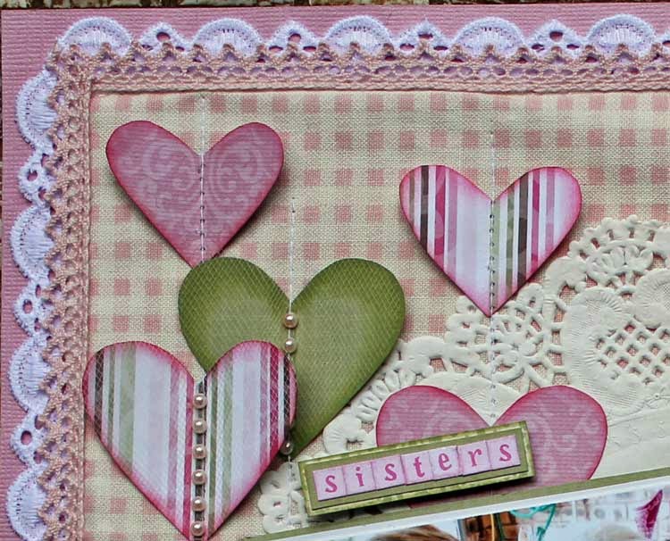
On my layout I used a piece of fabric as my background, which I ironed Vliesofix to the back of, to make it easier to handle. I stitched some fabric lace as a border, then attached the fabric, then glued a second row of crotched lace around the edge. I then placed a paper doily (double layer) onto the fabric and stitched a length of fussy-cut paper lace across the page. There are a couple of layers of tulle beneath this but it is very difficult to see.
Originally, I intended to cut the hearts from Vliesofix backed fabric but couldn't find any that went with my colour scheme so I used scraps of pattern paper that I already had which co-ordinated perfectly. I inked the edges of the hearts, then stitched them to my background. The larger hearts have a tulle covering to add a bit of softness.
After that I added some gorgeous embroidered floral lace, some fussy-cut flowers (again from left-over paper scraps), a chipboard heart already finished in gold (which I used as a frame for my journalling) and my photos.
I think the fabric background, the tulle and the lace give a softness to the look of my layout and reflects the use of fabric in the cushion. Thanks ARTastic for the inspiration. Also, many thanks to Julie at TIME TO CREATE for generously giving her valuable time to help me out yet again.
Cheers, Chris.
Tuesday, August 19, 2014
Tuesday, July 8, 2014
Aussie Beach Babe - Chris Sexton
ARTastic provided an amazing poster depicting the Australian beachside lifestyle of the 1930's as its inspiration for July, with the criteria of using striped pattern paper. As an added challenge, ARTastic combined with CSI, providing the extra criteria of using polka dots, scallops, distressed edges, the colours of the poster and journalling on stripes.
I found a wonderful photo of my mum at the beach, looking stunning, taken in the late 1940's, so I decided to create a beach layout. I wanted it to be stylised like the images in the poster so I drew simple shapes to depict the sun, clouds and waves. I used an unadorned bright blue background to reflect the clean lines of the poster.
I used striped pattern paper to create a beach towel, I punched a scalloped edge along each end, and used the holes to tie stranded embroidery thread to create a fringe. The stripes on the towel provided me with the perfect spot to do my journalling.Scallops were also used on the sun and clouds and I used yellow polka dot paper to depict the sand on the beach, which I inked, then distressed round the edge for added texture. I also distressed the edge of the clouds.
I added some blue mesh to depict the sea and some chipboard shells, which I painted with Liquid Pearls.
As a finishing touch I used two tones of yellow embroidery thread to hand-stitch a border round the page, then inked the edges.
I love how bright and colourful the layout is, and how all the elements reflect our Aussie lifestyle. I really enjoyed the challenge.
Cheers, Chris.
Tuesday, May 27, 2014
Precious Moments - Chris Sexton
Hi, everyone. I've been following the Pixels and Paper Challenge site for a while and I finally decided to enter a layout. I loved May's inspiration photo of ladies in white dancing in a field round a maypole. It reminded me of my wedding day, as we had our photos taken in a local park among the trees and flowers. Our photographer snapped away as we fooled around and one of my favourite photos is of my husband and I dancing together, laughing our heads off and having so much fun. The light was fading and the photo quality isn't great but I love the feelings it stirs in me. We were so in love and beyond happy that day.
I have created a monochrome layout as I wanted to keep the colours simple and stick with a green and white theme to reflect the location of the photo shoot. The lace border portrays the lace edging on my dress, and the white embossed cardstock reminds me of my dress fabric, which had a small sprig embossed into it.
This park had a special wooden entrance and a timber fence, so I chose chipboard pieces , which I finished with white Glossy Accents, to represent this.
I found some gorgeous pattern paper by Basic Grey that I've had a number of years, which made a perfect background. All I had to do was stamp some foliage in a darker green behind the fence.
I finished off with some green ribbon vine, pearl flourishes, flower sprigs and rosebuds, plus a LOVE tile embellishment.
I'm really happy with the result. I hope you like it too.
Cheers,
Chris.
Tuesday, May 6, 2014
Cherish - Chris Sexton
I loved the ARTastic inspiration artwork for May, AMARYS by Robert Hagan. It made me wish I had a photo along those lines but not having had children of my own made that difficult. The mother and child photos of my sister and my nieces I'd already done layouts for and unfortunately I have no photos of myself with my mother when I was a child. This situation resulted in me frantically searching through numerous boxes and lo and behold, I came across a photo of my husband and his mum taken on the day of his christening. I'm sure he's wearing an outfit made by his mother as she was a prolific knitter. She looks so proud of him and he looks quite pleased with himself.
I wanted to emulate the scalloped edge of the baby bonnet so I added several rows of paper lace down the side of the photo. Some of these were punched and some were fussy cut from pattern paper. Inked edges and a few pearls finished them off.
The paper I used for the background had gorgeous roses round the border so I used rosebuds and sweet little daisies in the top corner of the layout. I rolled the corner and backed the flower arrangement with some paper lace and cardstock.
Because the inspiration piece had flowers in it I added lots more rosebuds and daisies to a chipboard flourish on the left side of the photo. The underlying leaves were die-cuts from a kit which I toned down with Tim's Distress Stain - Picket Fence. The crocheted doily is a nod to my husband's mum and the pearls reflect her pearl necklace.
I loved doing this layout and am grateful for the push to find an appropriate photo. Thanks for the inspiration.
Cheers. Chris.
Tuesday, April 22, 2014
Laughter is.... Chris Sexton
ARTastic's April challenge called for the depiction of silliness, crazy antics or just having fun. My layout includes a photo of myself and two friends dressed as clowns.
We were part of a team of 23, called "Clowns for a Cure" that participated in our recently held, local "Relay for Life". We were all there not only to raise money for cancer research, but to support each other, as seven of us had survived cancer and another seven had been carers for family members who had been through cancer.
My friend Lyn (on the left) and I (centre) have both survived cancer and been in remission for over ten years. We feel pretty lucky and are of the opinion that life is too short to be serious all the time, and fun and laughter are the best medicine. We had a great time and carried on like school kids with lots of silly nonsense on the day.
I used the colour scheme from ARTastic's inspiration piece of yellow and orange for my background, which I misted with Glimmermist, and stamped with a Kaisercraft stamp called "Arty" in black to include the squares of the chessboard. It was then simply a matter of layering pieces of pattern paper, more misting and stamping, adding a journalling pocket, some ribbon, a few embellishments and a title and I was done.
I used bright colours, sparkly alphas and KindyGlitz to jazz up the layout, to reflect the rainbow colours of our wigs and to make the whole thing feel fun and a bit crazy. I hope you think I've succeeded.
Thanks for the opportunity to be involved in the challenge. I look forward to seeing next month's inspiration piece.
Cheers,
Chris.
Tuesday, March 25, 2014
Green Thumb in Training!
The challenge put up by ARTastic for March was to use texture. I loved the inspiration of "Bluebirds" but didn't have any "bird" photos, however I felt the photo I used had a "bird" connection so I went with it. The day this photo was taken my great-niece Lilly was learning how to garden with the help of her wonderful grandma. It was a lovely, sunny day and the birds were chirping and flying around. If you look really carefully in the top, left-hand corner of the photo, you can even see a bird flying by.
I then added an assortment of flowers, some of which I layered for more texture. Some of the flowers have fluffy yellow centres, some have hard jewelled centres. I found a vine of gold leaves, which I cut into separate pieces and added to the bird's wing.Even though the striped paper has no surface texture, it gives the impression with the print of the leaf skeleton.
Hope you like my efforts.
PS Thanks to everyone who left comments on my entry for February. I really appreciate your comments and your support.
Cheers, Chris.
Tuesday, February 18, 2014
Trick or Treat - Chris Sexton.
The ARTastic Challenge for February is to use paint and ink. This was a bit of a challenge for me as I don"t often do messy. I loved the inspiration piece but didn't have a photo with a red, blue and black colour combo so I went with what I had.
The photo I chose is of my great-niece Lilly having her first Halloween experience. She loved dressing up and "trick or treating" with her mum in the street where she lives. Once I chose my background paper I then had lots of fun making a mess of it with the paint and ink-although I must admit it ended up being a fairly controlled mess.
I sponged white paint through a zig-zag stencil (which represents the sharp points of her fingernails) then used black ink with another stencil to create the suggestion of cracked paintwork (which you'd probably find in a witch's hovel). I then splattered black watercolour paint in random spots just for fun. I then stamped a faux stitched border in black ink.
Once the background was done I distressed the edges then tore some areas where I wanted the suggestion of spider webs which I created using gauze .I then used corrugated cardboard, which I added green paint and Kindy Glitz to, to place under my photo. All that was left to do after that was to add more gauze, a journalling pocket, a couple of tags and a scary looking spider, which I inked red and black then finished with Glossy Accents. I mounted my photos with red and mounted them on 3-D tape to help them pop off the page. Lastly, I inked some chipboard stars then glitzed them up. All done! Hope you like my efforts.
Cheers, Chris.
Subscribe to:
Posts (Atom)


